

How often, noticing something beautiful, harmonious, do you think about why it looks beautiful? Why did something attract attention? How does it stand out from the rest of the surrounding space? Even in the days of antiquity, philosophers and thinkers asked these questions, trying to find answers in the field of the human heart or even the soul. However, with the development of exact sciences and a detailed study of the human body, it became clear that the paths lead to our brain…
In the 17th century, the German philosopher Alexander Baumgarten introduced the term aesthetics to define the sensory cognition of reality. He combined the attempts of scientists to answer the question “What is beautiful?” The question that Plato raised in his works, at the time when the golden section was considered the standard of beauty and harmony – the division of a segment in which the greater part refers to the lesser, as the entire segment refers to the greater. That is, the category is totally mathematical and even geometric. But it was this category that was incorporated in hundreds of architectural ensembles of antiquity and works by outstanding artists.
Today, the definition of the perception of art, beauty, and harmony is not limited only to ideal mathematical proportions. The research results have shown that aesthetic feeling is a combination of psychophysiological, neurophysiological, and neurochemical processes of the brain. So, at the junction of cognitive psychology, neurobiology, and aesthetics, the science of neuroesthetics emerged.
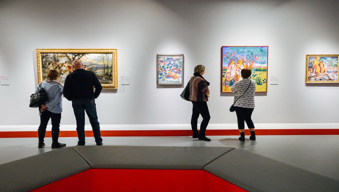
The term neuroesthetics was introduced by British neuroscientist Semir Zeki. With the help of neuroimaging technology, he found out which parts of the brain are responsible for the perception of the beautiful and aesthetic. In Zeki’s experiment, several dozen people looked at paintings by famous artists – Leonardo da Vinci, Sandro Botticelli, Claude Monet, Paul Cezanne, and others.
Magnetic resonance imaging showed that the activity of certain areas of the brain of the test subjects increased by 10%. In addition, in the orbitofrontal cortex, which is responsible for pleasure and desire, the scientist noticed a surge of dopamine. In a 2009 article, Semir Zeki wrote that “…the artist is in a sense, a neuroscientist, exploring the potentials and capacities of the brain, though with different tools. How such creations can arouse aesthetic experiences can only be fully understood in neural terms. Such an understanding is now well within our reach.”
Speaking about the perception of beauty and art, it is impossible not to mention the role of vision.
As we know, the human eye is a complex system consisting of several biological lenses. The outer shell of the eye is called the cornea. It receives rays emanating from each point of the object and transmits them through the pupil to the lens. In a lens or biconvex lens, the rays passing through the surface gather at one point, forming a copy of the observed object. After that, the image falls on the retina, the inner surface of the eye. There is a feeling that a certain picture is formed on the retina, but in fact, the projection consists of photons that are converted by the receptors and neurons of the retina into an electrical signal. It is this signal that passes further into the brain, where it is processed by the visual cortex.
But how does our visual system distinguish colors? Biologist Vyacheslav Dubynin explains: the retina of the human eye contains something like a matrix. “It perceives electromagnetic waves – what we call light. Photosensitive sensory neurons – rods and cones – are responsible for processing the light stimulus. One type of rod reacts to a conditionally gray color, with its help we form a black-and-white picture. And three types of cones, sensitive to blue, green, and red, are responsible just for color perception. Both rods and cones work in much the same way as, for example, chloroplasts of plants that perceive light and then synthesize glucose. And instead of glucose, we have electrical impulses that escape to the brain. The rods were originally developed to see at dusk when only red, blue, or green is missing. Therefore, evolution has come up with an integrator that combines all colors. It’s like we sacrifice color to at least see something at dusk. And during the day there are three types of cones, which means that at the retina level we see only red, blue, and green.”
An attentive reader has probably noticed that we are talking about only three colors. Although in everyday life we see many different colors and shades. But in fact, our eye sees only pure colors. “There is no orange, or purple, or the color of a wet asphalt. All this is the work of our inner photoshop, which, with the help of this illusion, tells our consciousness how much we see red, blue, and green.”
At one time this biological feature seriously influenced art. So, in the middle of the 19th century, Hermann von Helmholtz presented his theory of color perception in several books that young French artists came across. The latter began to paint with pure colors, refusing to mix paint on a palette. So, Helmholtz’s works influenced the emergence of Impressionism. The same law of optics was used by pointillists who draw with dots. The most real manifestation of neuroesthetics.
But in addition to purely visual features, it is important to consider the neurobiological foundations of human artistic experience. V. S. Ramachandran, Professor of Psychology and Neurophysiology at the University of California San Diego and Director of the Center for Brain and Cognition formulated a whole theory based on the laws of perception of creativity. To date, this is the most basic theory of neuroesthetics, but, as the scientist notes, there may be more such laws in the future.
The first principle described by Ramachandran is called grouping. The scientist explains it this way: the human brain gets pleasure when it manages to solve a riddle or assemble a whole image from randomly scattered elements. That’s why we like to look at Impressionist or Pointillist paintings so much. Most likely, evolution is involved here. Ancient people needed some kind of physical motivation to look for a camouflaging prey during hunting.
The professor cites Renaissance canvases as an example, “…the same azure blue color repeats all over the canvas as part of various unrelated objects. Again, your brain enjoys grouping similar-colored splotches. It feels good…”
The second principle is maximum displacement. In art, this manifests itself in the form of a cartoon, that is, intentional exaggeration in the portrayal of a person or phenomenon. As it turned out, the brain “likes” enlarged objects and elements. In his book The Tell-Tale Brain, Ramachandran gives one interesting example from the animal world, especially from the work of Nobel laureate, biologist Nikolaas Tinbergen, who studied seagulls in the 1950s.
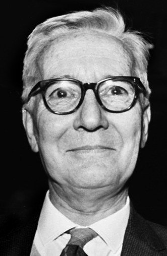
Nikolaas Tinbergen is a Dutch ethologist, zoopsychologist. He studied the role of stimuli in animal behavior, the basic biological patterns and mechanisms of animal behavior and orientation, the relationship of innate and acquired components of behavior, its evolution, and adaptive significance
From The Tell-Tale Brain, 2012: “Tinbergen studied herring gulls, common on both the English and American coasts. The mother gull has a prominent red spot on her long yellow beak. The gull chick, soon after it hatches from the egg, begs for food by pecking vigorously on the red spot on the mother’s beak. The mother then regurgitates half-digested food into her chick’s gaping mouth. Tinbergen asked himself a very simple question: How does the chick recognize its mom? Why doesn’t it beg for food from any animal that’s passing by? Tinbergen found that to elicit this begging behavior in the chick you don’t really need a mother seagull. When he waved a disembodied beak in front of the chick, it pecked at the red spot just as vigorously, begging the beak-wielding human for food. […] In fact, Tinbergen found that you don’t even need a beak; you can just have a rectangular strip of cardboard with a red dot on the end, and a chick will beg for food equally vigorously. […] To his amazement, Tinbergen found that if he had a very long thick stick with three red stripes on the end, the chick goes berserk, pecking at it much more intensely than at a real beak. It actually prefers this strange pattern, which bears almost no resemblance to the original!”
Ramachandran concluded that this is probably how the receptive fields of animal and human neurons work: they respond more actively to exaggerated stimuli.
The third principle of neuroesthetics, formulated by the neuroscientist, is based on the perception of contrasts. Contrast plays an important role in our visual process. With its help, we separate objects from the background, outline edges and borders, focusing on the main objects.
From The Tell-Tale Brain, 2012: “Contrast is important in art or design; in a sense it’s a minimum requirement. It creates edges and boundaries as well as figures against background. With zero contrast you see nothing at all. Too little contrast and a design can be bland. And too much contrast can be confusing. Some contrast combinations are more pleasing to the eye than others. For example, high-contrast colors such as a blue splotch on a yellow background are more attention grabbing than low-contrast pairings like a yellow splotch on an orange background. It’s puzzling at first glance. After all, you can easily see a yellow object against an orange background but that combination does not draw your attention the same way as blue on yellow.”
In addition to the principle of exaggeration or maximum displacement, the scientist formulated the principle of isolation. The artist separates or isolates those objects that the viewer should pay attention to. In this way, the brain understands easier and faster what it needs to concentrate on. The bottom line is that a person cannot focus on a multitude of images. Attention resources are extremely limited. At the same time, it is attention that enhances emotional reactions.
From The Tell-Tale Brain, 2012: “Earlier I emphasized peak shift – hyperbole and exaggeration in art – but now I am emphasizing understatement. Aren’t the two ideas polar opposites? How can less be more? The answer: They aim to achieve different goals. […] In the dynamics of perception, one stable percept (perceived image) automatically excludes others. Overlapping patterns of neural activity and the neural networks in your brain constantly compete for limited attentional resources. Thus when you look at a full-color picture, your attention is distracted by the clutter of texture and other details in the image.”
The fifth principle is based on solving perception problems. The professor notes that we quickly lose interest in explicit and simple images. It is much more interesting to look at different unusual combinations, as well as objects hidden at first glance. This feature of perception depends on the activity of visual neurons that are connected to the limbic structures of the brain responsible for emotions and pleasure. That is, the brain gets pleasure from just searching for a hidden object.
And also, the brain “dislikes” coincidences. In ordinary life, we are used to seeing nature diverse, so artists try not to give the brain reasons to be bored. Whereas too bright coincidences look unnatural, suspicious, and therefore unsightly.
Order and rhythm also have a positive effect on a person’s perception. Repetitive forms give a sense of calm because one can predict what happens next. In addition, in ordinary life, most people strive for order: we move a chair in a right place, hang a picture as straight as possible. But if we talk about art, even an artist adds something odd to repetitive elements. Therefore, to date, scientists have not yet found the most effective balance between absolute order and catastrophic chaos.
Hence follows the principle of symmetry. We know that symmetry brings aesthetic pleasure. At the same time, the most symmetrical objects are alarming. As we found out, this is because the brain does not like coincidences. Therefore, artists try to find the perfect ratio, “pleasing” the brain and creating something aesthetically beautiful. But this applies specifically to objects, not multi-subject compositions, Ramachandran clarifies.
The latter principle is called a visual metaphor. From the school curriculum, we remember that the purpose of a metaphor is to depict an object or phenomenon more vividly, using seemingly incompatible definitions. But there is enough room for metaphors in painting. For example, an artist depicts not just a cigarette, but a cigarette in the form of a pistol barrel, thereby causing an association of danger.
Most likely, artists have used and continue to use these principles intuitively. However, using neuroesthetics, artists can create stunning works which will blow our minds and imagination. Perhaps in the future, we will learn more interesting details from the “life” of our brain and the peculiarities of art perception.
Related materials:
Lecture by Vyacheslav Dubynin for the Scientific Russia portal: Brain: general principles of neuroaesthetics
Vyacheslav Dubynin's interview for the Scientific Russia portal: Just a genius
Vileyanur Ramachandran's book "The Brain Tells. What Makes Us Human"
Links to sources:
Vyacheslav Dubynin. Neuroaesthetics. How art manipulates perception / My friend, you are a transformer!
Natalia Kienya. Neuroaesthetics: How our neurons react to paintings by da Vinci and Picasso / Theories and practices
Maria Serbina. What is neuroaesthetics, or how our brain perceives art / GQ
Photos on the main page: Nikolay Mokhnachev Scientific Russia


