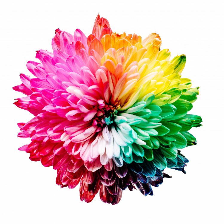
“Color is a product of light
that produces emotion”
Theory of Colors by J. W. Goethe
American housewives were asked to taste coffee from four different cups. Sitting nearby, there were boxes in various colors: brown, blue, red, and yellow. When the women were asked what they thought of the drink, the results were as follows: they thought that the coffee next to the brown box was too strong, while the coffee next to the yellow box was too weak, that next to the red box – flavored and delicious, and the coffee next to the blue box – mild and pleasant. But the coffee was the same in all four cups.
The experiment was conducted by scientists from the University of Wisconsin (USA). Color has interested people since the ancient times. For instance, Egyptian priests had their temples painted pink and dark blue. Hindus would deliberately let light go through painted glass or textiles. It was believed that they had healing powers. Color therapy is not part of the conventional medicine today, but the fact that color affects the human mind and perception has been scientifically proven.
Why Color Affects People
Color is waves of electromagnetic energy. We perceive it first with our eyes, then – with our brain. The retina consists of two types of nerve endings: cones and rods. They transform light into nerve signals. Rods are responsible for night vision. Cones come into play where there is a lot of light; they are responsible for perception of color and small details as well. The retina also has vision pigment – rhodopsin, which absorbs light waves. The cones, rods, and rhodopsin make our vision work. The retina keeps transforming light into nerve signals. Once the information has reached the brain, the person perceives color.
Light waves may differ in length, and the pigment absorbs them with varying intensity. This is why every color generates a different number of nerve impulses and has a different effect on the person. Long-wave colors have a greater impact. The “longest” of all colors is red. It activates all functions in the body and stimulates nerve centers. Meanwhile, blue is a short color. It calms and slows down the nervous system. Blue color is used in psychotherapy to produce a relaxing and calming effect. But overdoing it may lead to depression. In other words, colors stimulate different parts of the brain and the hypophysis. All that affects hormone production, metabolism, sleep, appetite, excitement, and emotional stability. Thus, we depend on colors around us.
Lüscher Color Test
Knowledge of color was systematized and applied in practice by Swiss psychologist Max Lüscher in 1923. He created a test based on the connection between color perception and the person’s internal state. During the test, subjects were asked to arrange a set of colored cards in order of preference, ignoring fashion and public opinion. Color affects the unconscious, opening possibilities for rapid testing in psychotherapy. The method was met with a storm of criticism for aspects such as: there were multiple versions of the test; it was hard to reproduce the shades for mass use; and the results were too generic. By the way, should you choose to take the test online, do not take the results too seriously. The genuine Lüscher color test is only possible with color cards printed on special paper, with natural light but without direct sunlight. However, the psychologist did establish that color generated human emotion. For instance, orange-red makes the pulse and breath faster and excites the nervous system, while dark blue has a calming effect.
There are multiple color tests in psychology. For example, in the USSR, psychiatrist Y. F. Bazhin and psychologist A. M. Etkind developed the Color Relations Test. The testing proved there was a connection between color and the persons’ relations with the world. The idea occurred to Bazhin as he worked. He invited a serviceman to take the Lüscher color test and then asked why the client disliked the gray color. It turned out that gray reminded him of his commander. The psychiatrist found that response interesting. The new method made it possible to tap one’s unconscious associations without having to deal with the protection mechanisms of the conscious mind.
Valeria Sergeevna Mukhina, a psychologist and a pedagogue, conducted a very simple but revealing test. Children aged 3 to 4 were asked to draw something good. The kids used yellow, red, orange, dark blue, and emerald green. “Children's color pallet for the wonderful is the same in all countries: they mostly use warm, clear, local colors,” the author writes. When the kids were asked which of their friends’ drawings pictured them beautifully and which didn’t, the color distribution was clear as well. The color perception is linked to emotion at any age.
Arranging by Color
White – for Europeans, white is normally the color of good and chastity. White calms down and gives strength.
Black is usually responsible for organization and expression of will power. It absorbs the entire color spectrum. However, black should not be abused in clothes and interior decoration as it may be bad for the mood.
Reds excites the mind, makes the heart beat faster and even stimulates muscle activity. Too much red may be bad for irritable people. It causes fatigue.
Indigo is the color of tranquility. It is beneficial before bed and curbs the appetite.
Blue helps one relax after a hard day. Along with indigo, it helps control the appetite.
Yellow, however, is excellent at stimulating the appetite. Shades of yellow tone up the nervous system and stimulate mental abilities.
Green calms and relieves psychological and visual pressure. All shades of green help increase concentration. However, dark green can cause depression.
Brown is a color of stability. Shades of light brown make one feel protected, while dark brown gives the feeling of being warm and cozy. Too much brown may cause a mild form of melancholia.
Orange invigorates and creates a good mood.
Pink is associated with vulnerability and naiveté. Pink should not be abused as it may be tiring.
It should be noted that cultural background is also relevant for the perception of color. For instance, in Japan, China, and some other Oriental countries, white is the color of mourning, while in Europe and Russia, it is seen as a positive color.
What Color Affects
Mood
Psychologists point out that color may be used to adjust a person’s emotional state. Some scientists focus on personality types. For example, according to the psychologist Nikolay Serov, warm color shades calm down irascible and impulsive people, increase light-mindedness in those with choleric temperaments, make contacts easier for melancholics, fill phlegmatic people with energy and help them concentrate, but lead to complete disorientation and absent-mindedness in those with sanguine temperament. Cold colors are bad for those with melancholic and phlegmatic temperaments, while they calm sanguine and choleric people.
Appetite
The color of tableware is an important aspect. It is not about whether it goes well with the tablecloth or the kitchen set color. The plate color will affect how hungry you are going to be. Imagine that! Green is perceived by the brain as beneficial and makes for desire to “improve one’s health.” The neutral white is also good for a meal. Yellow and orange actually increase salivation. Red things in the kitchen will make you eat as much as possible. Black, blue, and gray are associated with spoiled food. You would not eat more than intended off a gray plate.
Work Capacity
Color affects our work capacity and concentration. The ideal option for an office is a neutral design with bright elements in red, yellow, or orange. Surrounded with such objects, you will think faster, get tired less, remember things better, and be more cheerful. However, the abundance of bright-colored details may be irritating, so the main thing is not to overdo it. Green and blue would be good as well. These colors have a calming effect and help concentrate.
Style
Color in clothes is most important. In this case, perception also has the business culture aspect, which is important for building an image, particularly for public figures. Black and dark blue are associated with business-like attitude and austerity, bright colors – with creativity and energy. Burgundy and gold are considered to be status colors, which secured their positions through red carpets and platinum banking cards. Bright, intense colors catch the eye.
Medicine
Response to pain is individual. However, research has shown that some colors have an anesthetic effect. The subjects in an experiment were looking at some objects of various colors for some time and then were hit with a moderate electric charge. The red color caused pain; dark blue and green reduced it; and white turned out to be the best anesthetic.
Leisure
Your home is a space where color is most important. Color-based solutions to organize space may even make a tiny one-bedroom apartment feel spacious. For instance, white and any light shades create a feeling of freedom, lightness, and space. Particular color combinations for the walls, the floor, and the ceiling can change the perceived room width and even “raise” the ceiling. Dark blue, green and gray, especially if combined with white and beige, will help you relax. Warm specter shades, pastel pink and even subdued purple will have a calming effect. The energetic yellow will fill you with energy and make you think positively.
Working with Consumers
Color marketing is most actively used today. Consumers’ cultural associations are triggered before the consumer can figure out why they need the tenth product in their shopping cart when they really came just to buy some bread and black tea. Marketing tricks may be primitive or very interesting. For example, the McDonald’s logo follows the best color marketing traditions: yellow on the red background are the colors that catch the eye, fill you with energy and stimulate appetite. Children would choose these colors; and the strongest habits develop in childhood. Today's generation often associates McDonald’s with the taste of childhood.
Color Laboratory
There is a “color laboratory” at Smolensk State University in Russia, where scientists don’t just use modern technology and innovative equipment to investigate the impact of color on the human body, but apply their new knowledge in practice. The laboratory develops design projects for specialized institutions: daycare centers, schools, hospitals, hospices, and centers for the disabled. They also investigate the development of color vocabulary and associations. We wrote about it in detail.
Color is not just a method to tell one thing from another; it is a system with a strong impact on living organisms, particularly on humans.
Sources:
Nikolay Serov. Color treatment. Fashion and Harmony
Color Hurts. The Effect of Color on Pain Perception
The Effect of Color on Visual Perception of a Small Apartment
In the Kaleidoscope of Color Names
Interesting references:
- Color Psychology by Harald Braem
- Psychosemantics of Color by P. V. Yanshin
- The Little Book of Colour: How to Use the Psychology of Colour to Transform your Life by Karen Haller
- Secret Language of Color. Science, Nature, History, Culture, Beauty of Red, Orange, Yellow, Green, Blue, & Violet by Joann Eckstut and Arielle Eckstut
- The Secret Lives of Color by Kassia St. Clair
Фото на странице и на главной странице сайта: Sharon Pittaway / Фотобанк Unsplash


